
Would you believe that there are over 2 billion websites on the internet today? And by the time you are done reading this post, there will be thousands more launched?
Staggering numbers for sure, and if you are a website owner looking to grow your brand’s presence those figures might be a little intimidating, even discouraging.
After all, how in the world are you going to stand out from the crowd when the crowd is over 4 billion strong?
Good question.
But before you panic and shut down your online entrepreneurial dreams, here is some context for you.
Many, many, many of those sites are inactive and just plain bad.
They are not fast.
They are not mobile friendly.
They are not user-friendly.
Oh, and they are as ugly as sin. 🤮
So the reality is this; if you invest in and prioritize your website’s design you can stand out from the myriad of awful websites out there competing for your audience’s attention.
In other words, great design is a MUST if you want to grow brand presence.
Here are six basics of great website design in no particular order:
1. Modern and clean.
Brands that are known for great design (like Apple) all look modern, clean, and in many cases minimal. Meaning they…
- Have embraced the use white space.
- Use fonts that are crisp.
- Keep color palettes simple.
- Use plenty of imagery but without overdoing it.
- Break text areas into scannable, small digestible chunks.
Bottom line…
If you want to stand out from your competition make sure your site features contemporary design and doesn’t look like it was built with Frontpage in 2001.
2. Responsiveness.
What is responsiveness? Simply put… all elements of your site shrink and grow depending on the size of the screen or device without having to pinch or zoom.
This has never been more important as in today’s online world over half of your web traffic comes via mobile users utilizing a wide variety of devices and screen sizes.
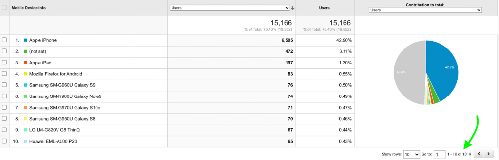
Here is a real example from one of our client’s analytics accounts (notice this is just page 1 of 1,819!)
Of course, true responsiveness involves more than simple shrinking and expanding. It also means that when the size of a user’s screen changes all margins stay consistent, alignment of elements remains aesthetically pleasing, and the padding between elements is sufficient without becoming excessive.
Bottom line…
If your site doesn’t respond well more than half of your visitors are going to leave and look for a competitor’s site that does.
3. Clear calls to action.
One of the most common cardinal sins we see with many websites is that they fail to communicate any call to action whatsoever to the user. In other words, once a visitor arrives they have no idea what they should do next… so typically they just leave.
Solid web design includes clear calls to action communicated through headlines, web copy, and buttons that just beg to be clicked. Here are some examples of what we mean:
- Learn More
- Buy Now
- Sign Up
- Watch Video
- Schedule a Call
Bottom line…
If you want your users to engage with your brand don’t be vague about what you want them to do next, clearly and prominently state that fact.
Pro tip: Avoid confusing visitors with multiple calls to action. Focus on the one or two actions you want them to take first and foremost.
4. Simple navigation.
Here’s a question for you… When trying to get somewhere, do you prefer a long complicated list of directions or directions that are as simple as possible?
Well, unless you are a glutton for punishment and getting lost, most likely you want directions that are short, sweet, and easy to follow. And you know what?
Your website visitors are the same way.
A website’s navigation acts kind of like a map for your visitors in that it provides a clear direction to all the main areas of your site that may be of interest.
Want to read our blog? Click here.
Want to know more about us? Click there.
Have questions?
Well you get the point.
This is why a well designed website has a simple and clear navigation structure. So your visitors can get where they want without having to poke all around your site getting frustrated along the way. Your site’s menus should be easy to spot, work well on desktop and mobile, and should be organized in a logical and intuitive manner.
Bottom line…
You have content you want to get in front of your users. The only way to make sure that happens is by having a navigation bar and/or menu layout that makes your (and their) job easy and painless.
5. Quality imagery.
This is a blog post about design, right? Well it then goes without saying that quality design will effectively leverage the use of quality imagery. Static, boring, and unsightly images will not enhance your website’s appeal at all, and in fact, may only serve to chase people away.
But what is “quality?”
Good question. Depends.
Quality images involve more than just simple appeal. Here are some considerations to make when selecting pictures and imagery for your web pages.
Relevance – Are the images you use relevant to your copy and brand. If you are writing a post about health and fitness then a picture of a kitten stuck in the tree completely misses the mark no matter how cute the kitten is.
Cropping – Undoubtedly you will need to use a wide array of image dimensions to work with all the different needs of your site. Sometimes you may need a square image, sometimes a tall one, and sometimes a wide one. Make sure you select images that work with the space you have and if you need to crop your images, ensure when doing so you don’t cause your pictures to look awkward, unfinished, or cut off.
Crispness – Regardless of what images you end up using, always be sure that your original photos are large and crystal clear without any hint of distortion of pixelization. When your images are uploaded and embedded they should be reduced in size so your page speed doesn’t suffer, but if the original image is crisp then the compressed versions should be as well.
Vibrancy – This one may depend on the look and feel of your site. Some older designs favor filtered images and colors so you want consistency across your site, but in general choose images that are colorful, vibrant, and adequately saturated. Images are meant to capture a user’s attention so using photos that are monochrome or muted just come across as boring and uninteresting.
Unique and legal to use – Ok, this may not sound like a design issue but if you want your site to stand out then you should not be using clipart that 500,000 other websites use as well.
And, always make sure the images you select grant you the proper usage rights before posting them.
Bottom line…
Quality design starts with what you see and if your use of imagery is poor, boring, or choppy not many people will look beyond that fact. Meaning, if they see bad images and photos the common assumption will be that the rest of your website (and brand) follows suit.
6. Functionality
Steve Jobs said it best, “The design is not just what it looks like and feels like. The design is how it works.”
We hardly can argue with that statement as Apple has always been a leader in product design that is not only beautiful and elegant, but also very intuitive and easy to use. This is one of the reasons why Apple had a remarkable five of the ten most sold smartphones in 2020.
Jobs understood a really basic principle of design – No matter how beautiful a product is, if it’s hard to use or just plain broken then its beauty is irrelevant.
People want aesthetics, but they want solid functionality even more.
This principle applies not only to physical products, but also digital platforms like your website. If your website is clunky, glitchy, or just plain user unfriendly then people will not stick around too long to figure that out.
When appraising your site’s design ask yourself these questions:
- Does the flow or design make sense?
- Do links and buttons work on a single tap?
- Are my eyes drawn to key elements that make the user experience seamless?
- Does anything stand out as odd or misplaced?
- Can I walk through a session without hitting some sort of hiccup or stall?
Bottom line…
Make sure everything on your site works and works well. You want to create a pleasant user experience and not a frustrating one. If you don’t, your visitors will make it clear how they feel about your “design” by their abrupt departure.
These are just six core elements of quality website design.
There are of course more if you really want your site to stand out, but nail these six and you will be that much farther ahead of your competitors.
Of course if you want some guidance and help with this stuff, schedule a free consultation with our team, and we will be happy to evaluate your site’s design and make some suggestions on how to improve things.
